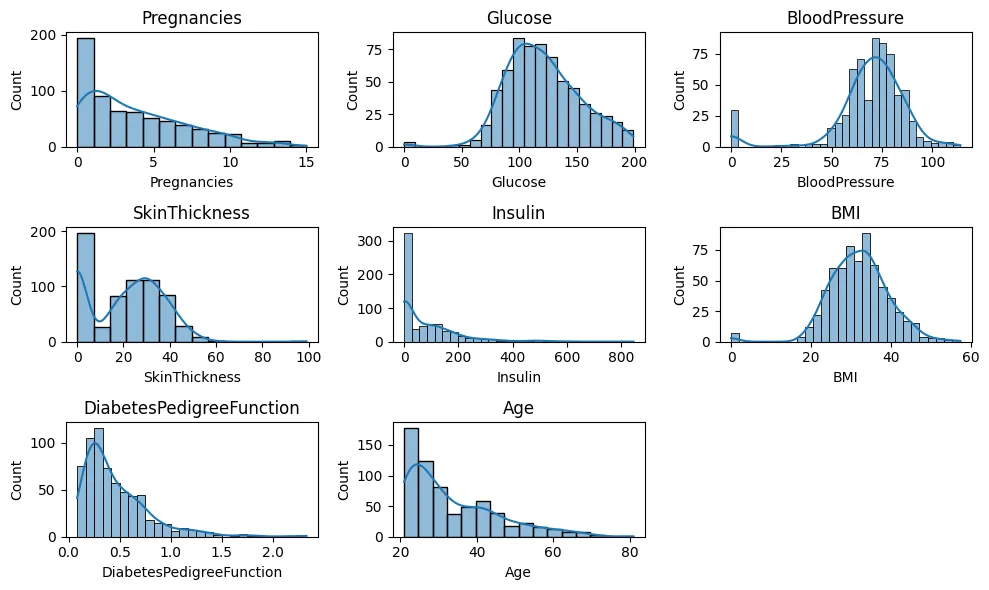
히스토그램 + KDE
features = train.columns[1:-1 ] # label 변수 제외
plt.figure(figsize=(10,6))
for idx, feature in enumerate(features):
ax1 = plt.subplot(3,3,idx+1)
plt.title(feature)
plt.tight_layout()
sns.histplot(x=feature, data=train, kde=True)
plt.show()
Python
복사
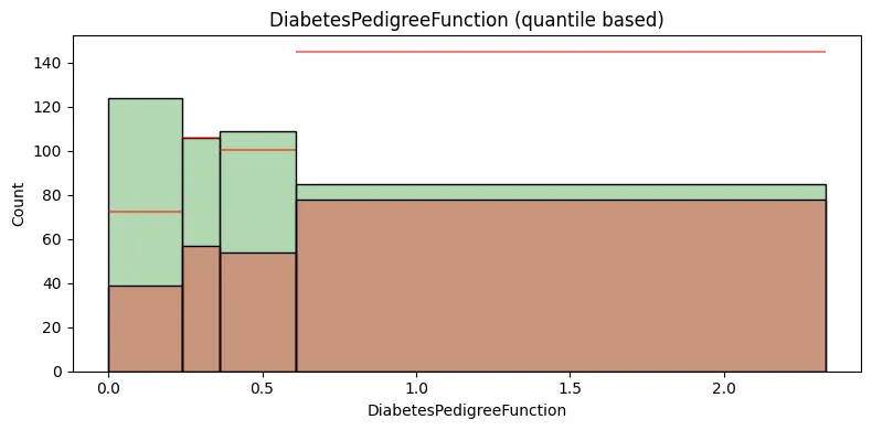
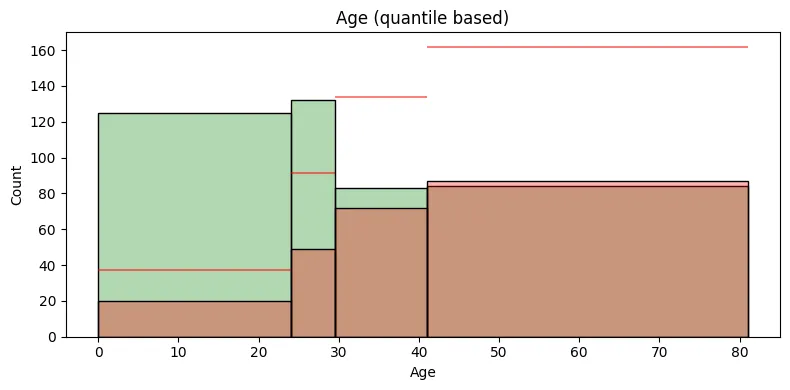
범주형 변수 분포에 따른 연속형 변수 분포 비교
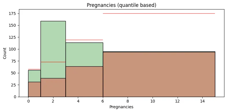
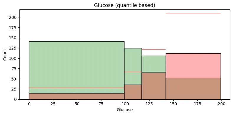
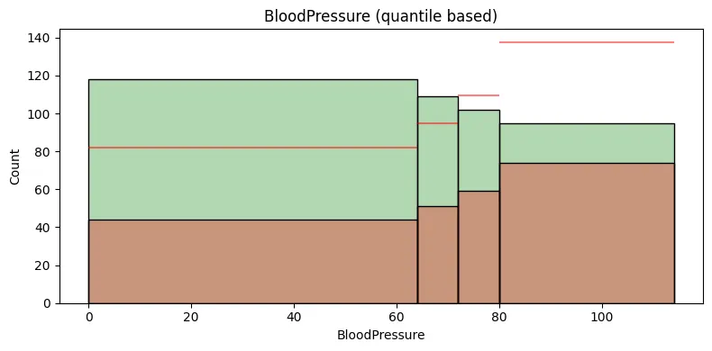
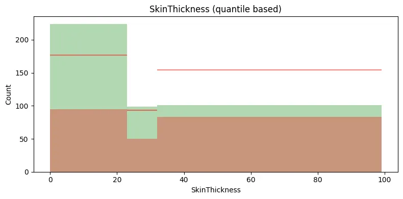
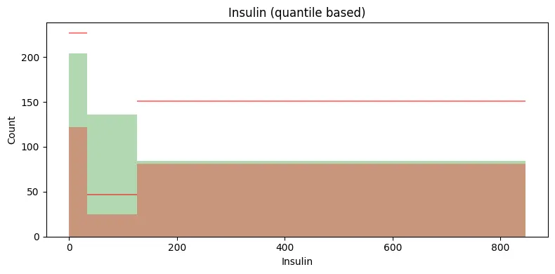
selected_feature = 'BMI' # 'Pregnancies', 'Glucose', 'BloodPressure', 'SkinThickness', 'Insulin', 'BMI', 'DiabetesPedigreeFunction', 'Age'
plt.figure(figsize=(8,4))
# 사분위 수 계산
q1 = np.percentile(train[selected_feature], 25)
q2 = np.percentile(train[selected_feature], 50)
q3 = np.percentile(train[selected_feature], 75)
q4 = np.percentile(train[selected_feature], 100)
q_lst = [ 0, q1, q2, q3, q4]
# target class 1의 갯수 대비 target class 0의 갯수의 비율 구하기
num_class0 = len(train [ train['Outcome'] == 0 ])
num_class1 = len(train [ train['Outcome'] == 1 ])
ratio_class1_class0 = num_class0 / num_class1
# 히스토그램 그리기
plt.figure(figsize=(8, 4))
h0_ax1 = sns.histplot(data=train[train['Outcome'] == 0], x=selected_feature, bins = q_lst, color = 'g', alpha=0.3, label='Outcome = 0')
h1_ax1 = sns.histplot(data=train[train['Outcome'] == 1], x=selected_feature, bins = q_lst, color = 'r', alpha=0.3, label='Outcome = 1')
# target 변수의 class가 1일 때의 각 bin의 높이(개수)와 경계값을 얻어옵니다
h1_heights, h1_edges = np.histogram(train[train['Outcome'] == 1][selected_feature], bins=q_lst)
# target class 1의 갯수 대비 target class 0의 갯수의 비율과 일치하는 각 구간의 수평선을 그린다
for i in range(len(h1_heights)):
plt.hlines(y=h1_heights[i] * ratio_class1_class0 , xmin=h1_edges[i], xmax=h1_edges[i+1], linestyles='solid', colors='red', alpha=0.5)
plt.gca().set_title(f"{selected_feature} (quantile based)")
plt.tight_layout()
plt.show()
Python
복사
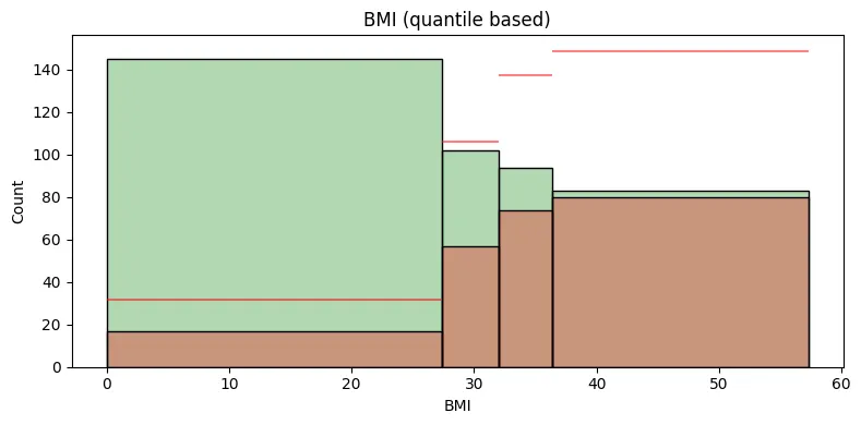
빨간색 수평선은 전체 데이터에서의 클래스 1대비 클래스 0의 평균적인 비율을 나타내는 참조선이다.
특정 구간에서의 클래스 0의 빈도수가 이 수평선보다 위에 있다면, 해당 구간에서의 클래스 0 그룹의 비율이 평균보다 높다는 것을 의미한다.
반대로, 수평선보다 아래에 있다면 해당 구간에서 클래스 0 그룹의 비율이 평균보다 낮다는 것을 의미한다.
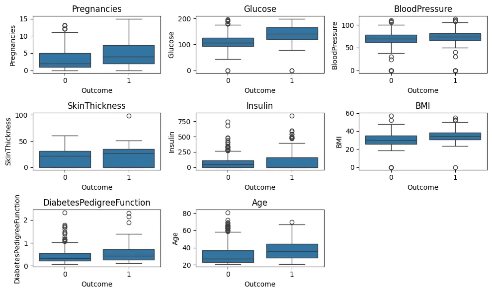
범주형 타겟 변수에 따른 연속형 변수 이상치 탐지 - boxplot
features = train.columns[1:-1 ]
plt.figure(figsize=(10,6))
for idx, feature in enumerate(features):
ax1 = plt.subplot(3,3,idx+1)
plt.title(feature)
plt.tight_layout()
sns.boxplot(x='Outcome', y=feature, data = train)
plt.show()
Python
복사