특징
•
빠름 (파이썬 기반 언어)
•
Web Application 기반
◦
웹개
•
공유 가능
•
유저와 상호 작용에 좋음(동적 기반)
◦
대시보드 만들기에 좋음
•
주로 프로토타입 만들 때 사용
•
주로 ML / DL 관련 토이프로젝트
•
스트림릿으로 구현한 웹을 바로 product로 사용하기엔 다듬어야 할 부분이 많아 디테일한 조정등은 CSS hack 을 통해 조정한다.
•
기본 element
import streamlit as st
Python
복사
Text element
•
title
st.title('This is title')
Python
복사
•
header
st.header('This is header')
Python
복사
•
subheader
st.subheader('This is subheader')
Python
복사
•
markdown
st.markdown('# Markdown 1st')
st.markdown('## Markdown 2nd')
st.markdown('### Markdown 3rd')
st.markdown('**_Markdown 진하고 기울임_**')
st.markdown(' - Markdown 글머리 기호')
Python
복사
•
divider : 구분선
st.divider()
Python
복사
•
caption : 설명, 각주
st.caption('caption - 설명, 각주, 작은 메모, 설명문')
Python
복사
•
code
웹페이지 상에서 코드 복붙이 가능한 형태로 나온다.
st.code('x=1234')
Python
복사
•
latex
st.latex(r'''a + ar + ar^2 + ar^3
''')
Python
복사
•
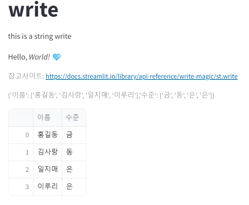
write
거의 모든게 가능한 만능 함수
◦
데이터프레임도 만들 수 있다.
st.title('write')
st.write('this is a string write')
st.write('Hello, _World!_ 🩵')
st.caption('참고사이트: https://docs.streamlit.io/library/api-reference/write-magic/st.write')
st.caption("{'이름': ['홍길동', '김사랑', '일지매', '이루리'],'수준': ['금', '동', '은', '은']}")
df = pd.DataFrame({'이름': ['홍길동', '김사랑', '일지매', '이루리'],'수준': ['금', '동', '은', '은']})
st.write(df)
Python
복사
Media element
이미지, 오디오, 비디오를 삽입할 수 있다.
st.image('이미지 url / 파일')
st.audio('오디오 url / 파일')
st.video('비디오 url / 파일')
Python
복사
Data display elements
•
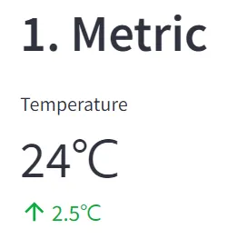
metric
박스 칸이라고 생각하면 편함.
st.title('Unit 3. Data display elements')
st.caption('참조사이트: https://docs.streamlit.io/library/api-reference/data')
st.header(' 1. Metric')
st.metric(label='Temperature', value='24℃', delta='2.5℃')
Python
복사
•
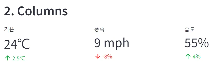
metric + columns
st.header('2. Columns')
col1, col2, col3 = st.columns(3) # 세 칸(열)을 형성
# col1, col2, col3 = st.columns([2, 1, 1]) -> 똑같이 3열을 생성하는데, 첫번째 열에서 2만큼의 자리를 생성
col1.metric('기온', '24℃', '2.5℃')
col2.metric('풍속', '9 mph', '-8%')
col3.metric('습도', '55%', '4%')
Python
복사
•
데이터프레임 조회, 수정
◦
write() = dataframe() : 스크롤바 생성/ table() : 고정형태
◦
data_editor() : 데이터 프레임 값 수정 가능
titanic = pd.read_csv('https://raw.githubusercontent.com/huhshin/streamlit/master/data_titanic.csv')
st.markdown('- st.dataframe(상위 15행)')
st.caption('dataframe, write- 10개 행 기준 스크롤, 열 크기조정, 열 정렬, 테이블 확대')
st.dataframe(titanic.head(15))
st.markdown('- st.write(상위 15행)')
st.write(titanic.head(15))
st.markdown('- st.table(상위 15행)')
st.caption('table- 형태 고정')
st.table(titanic.head(15))
st.markdown('- data_editor')
edited_df = st.data_editor(titanic) # 데이터프레임에서 값을 수정할 수 있음
st.write(edited_df)
Python
복사
Input Widgets
button, slider, widget, input 등의 widget을 통해 상호작용을 가능하게 해줌
•
link button
링크 버튼을 생성 → 체크 → 링크 웹페이지로 이동
st.link_button('Widget Link', 'https://docs.streamlit.io/library/api-reference/widgets')
Python
복사
•
button
클릭 취소는 불가
클릭 유무에 따라 나타나는 내용을 변경할 수 있다
# Say hello 라는 버튼이 눌리면 -> Hello 아니면 Good bye
if st.button('Say Hello'):
st.write('Hello')
else:
st.write('Good bye')
Python
복사
•
radio button
여러 선택지 중 하나 선택
genre = st.radio('좋아하는 영화 장르를 선택해주세요!',
('코미디','SF/액션','로맨스'))
if genre == '코미디':
st.write('코미디! 유쾌하신 걸 좋아하시는 분이시군요!👌')
elif genre == 'SF/액션':
st.write('SF 액션! 저도 익사이팅한 영화를 좋아합니다 😉')
else:
st.write('영화 속 사랑이야기, 현실과는 다른 모습을 볼 수 있죠 (❁´◡`❁)')
Python
복사

•
checkbox : 체크 박스
체크 박스 체크 / 체크 해제에 따라 공간이 생기고 없어짐
agree = st.checkbox('I agree')
if agree:
st.write('Me too' + '💕' * 10)
Python
복사
•
toggle : 스위치
스위치를 on / off 하느냐에 따라 문구가 생기고 없어짐
on = st.toggle('Please click on this toggle!')
if on:
st.write('Feature activated! 💫')
Python
복사
•
selectbox : 여러 선택지 중 하나 선택
option = st.selectbox('어떻게 연락 드릴까요?',('Email', 'Mobile phone', 'Office phone'))
st.write('네!', option, '으로 연락 드리겠습니다(●\'◡\'●)')
Python
복사

•
multiselect : 다중 선택
options = st.multiselect('좋아하는 색을 모두 선택해주세요',
['Green','Purple','Pink','Blue'],
['Green','Pink']) # 기본 선택값
st.write(', '.join(options), '색상을 좋아하시는군요!')
Python
복사

Input elements
•
text_input
텍스트 인풋
title = st.text_input('최애 영화를 입력하세요',
'After sun') # 기본값
st.write('당신이 가장 좋아하는 영화는 :', title)
Python
복사

•
number_input
수치 입력
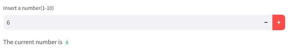
number = st.number_input('Insert a number(1-10)',
min_value=1, max_value=10, value=5, step=1) # value = 최초입력값, step = 증분값
st.write('The current number is ', number)
Python
복사
•
date_input
날짜 입력( 전후 10년까지의 선택지 선택 가능)
ymd = st.date_input('When is your birthday',
datetime(2024,10,10)) # 입력값 전후 10년까지만 선택 가능
st.write('Your birthday is:', ymd)
Python
복사

•
chat_input
챗봇 기능처럼 프롬프트 입력 가능 → 출력됨
prompt = st.chat_input('Say something') # 프롬프트 기본값
if prompt: # 프롬프트에 값이 입력되면
st.write(f'User has sent the following prompt:{prompt}')
Python
복사

Slider elements
•
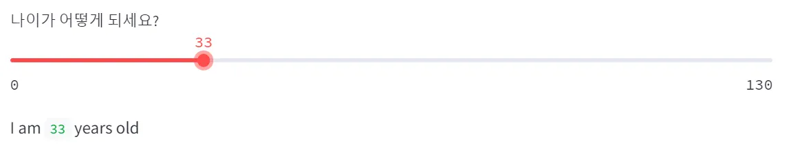
slider
# 밑 구간은 따로 조절 불가
age = st.slider('나이가 어떻게 되세요?',0,130,25) # 입력허용구간(0 ~ 130), 최초세팅값 25
st.write('I am', age, 'years old')
Python
복사
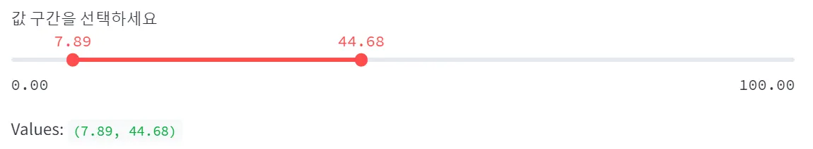
# 밑 구간, 윗 구간 모두 조절 가능
values = st.slider('값 구간을 선택하세요',0.0,100.0, (25.0,75.0))
st.write('Values: ', values)
Python
복사
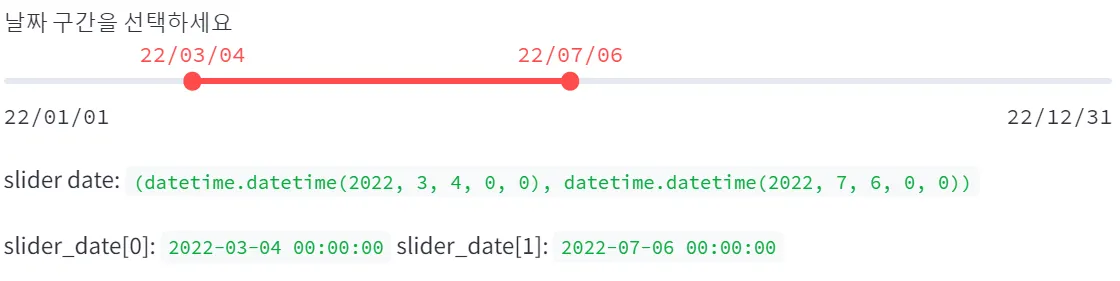
◦
날짜 구간 활용
slider_date = st.slider('날짜 구간을 선택하세요',
min_value = datetime(2022,1,1),
max_value = datetime(2022,12,31),
value=(datetime(2022,6,1), datetime(2022,7,31)), # 초기 설정 구간
format='YY/MM/DD')
st.write('slider date: ', slider_date) # 결과는 튜플
st.write('slider_date[0]:', slider_date[0], 'slider_date[1]:', slider_date[1])
Python
복사
◦
날짜 구간으로 데이터 조회하기
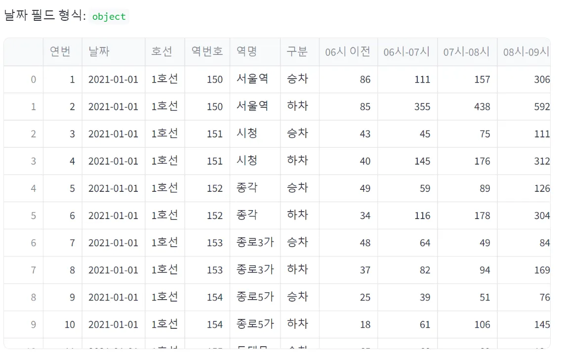
df = pd.read_csv('data_subway_in_seoul.csv', encoding='cp949')
st.write('날짜 필드 형식: ', df['날짜'].dtypes)
st.write(df) # 데이터프레임 내용 확인하기
Python
복사
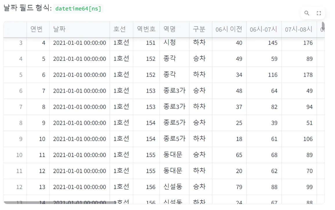
# 날짜 필드 string -> datetime 으로 변환
df['날짜'] = pd.to_datetime(df['날짜'], format='%Y-%m-%d')
st.write('날짜 필드 형식:' , df['날짜'].dtypes)
st.write(df)
Python
복사
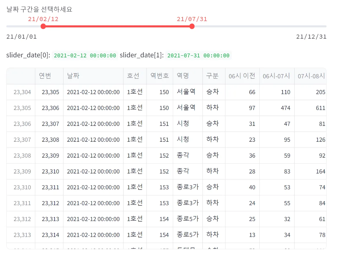
slider_date = st.slider(
'날짜 구간을 선택하세요.',
datetime(2021,1,1), datetime(2021,12,31),
value=(datetime(2021,7,1), datetime(2021,7,31)),
format='YY/MM/DD')
start_date = slider_date[0]
end_date = slider_date[1]
sel_df = df[df['날짜'].between(start_date, end_date)]
st.write(sel_df)
Python
복사
Layouts & Containers
Sidebar 를 만들 수 있다.
•
sidebar + with 사용하기
with st.sidebar:
st.header('1.Side bar')
Python
복사

add_selectbox = st.sidebar.selectbox(
'어떻게 연락 드릴까요?',
('Email','Mobile Phone','Office Phone'))
if add_selectbox == 'Email':
st.sidebar.title('📧')
elif add_selectbox == 'Mobile Phone':
st.sidebar.title('📱')
else:
st.sidebar.title('☎︎')
Python
복사
Columns 와 Tab 을 이용해서 칸과 탭을 만들 수있다.
•
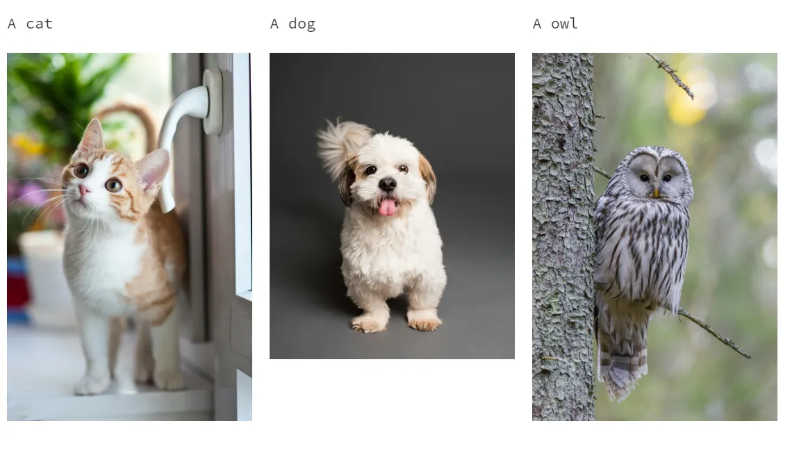
columns
col1, col2, col3 = st.columns(3)
# with
with col1:
st.text('A cat')
st.image('https://images.pexels.com/photos/2071873/pexels-photo-2071873.jpeg?auto=compress&cs=tinysrgb')
with col2:
st.text('A dog')
st.image('https://images.pexels.com/photos/3361739/pexels-photo-3361739.jpeg?auto=compress&cs=tinysrgb')
with col3:
st.text('A owl')
st.image('https://images.pexels.com/photos/3737300/pexels-photo-3737300.jpeg?auto=compress&cs=tinysrgb')
Python
복사
•
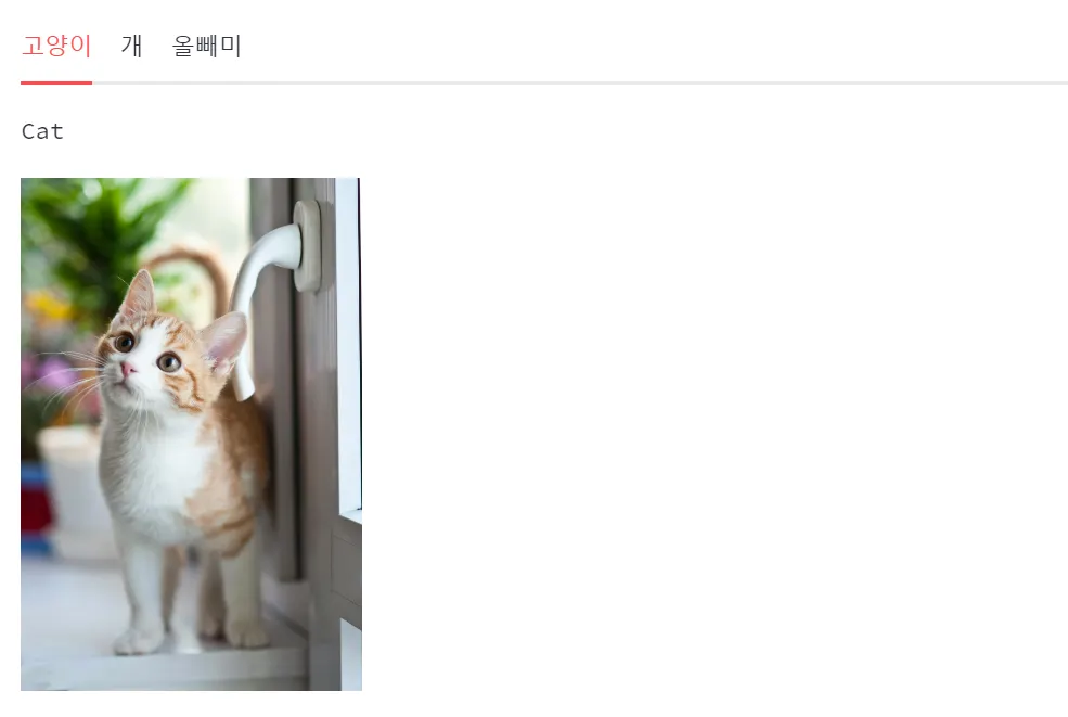
tabs
tab1, tab2, tab3 = st.tabs(['고양이','개','올빼미'])
# with
with tab1:
st.text('Cat')
st.image('https://images.pexels.com/photos/2071873/pexels-photo-2071873.jpeg?auto=compress&cs=tinysrgb',
width=200)
with tab2:
st.text('Dog')
st.image('https://images.pexels.com/photos/3361739/pexels-photo-3361739.jpeg?auto=compress&cs=tinysrgb',
width=200)
with tab3:
st.text('Owl')
st.image('https://images.pexels.com/photos/3737300/pexels-photo-3737300.jpeg?auto=compress&cs=tinysrgb',
width=200)
Python
복사
•
다중 페이지 설정(메인 페이지, 서브 페이지 등)
# 페이지별 내용을 담은 함수 생성
def main_page():
st.title('Main page 🎈🎈')
st.sidebar.title('Side Main 🎈')
def page2():
st.title('Page 2 ❄️❄️')
st.sidebar.title('Side 2❄️')
def page3():
st.title('Page 3 🎉🎉')
st.sidebar.title('Side 3 🎉')
Python
복사
# 딕셔너리 선언 {'selectbox 항목' : '페이지명' , ...}
page_names_to_funcs = {'Main Page':main_page, 'Page 2':page2, 'Page 3':page3}
# 사이드 바에서 selectbox 선언 & 선택 결과 저장
selected_page = st.sidebar.selectbox('Select a page', page_names_to_funcs.keys())
# 해당 페이지 부르기
page_names_to_funcs[selected_page]()
Python
복사
Data Handling
df = pd.read_csv('data_subway_in_seoul.csv', encoding='cp949')
st.write(df)
st.text("2. 구분이 '하차'인 행만 새로운 데이터프레임으로 저장 & 확인")
df_off = df[df['구분']=='하차']
st.write(df_off)
st.text("3. '날짜','연번','역번호','역명','구분','합계' 제외하고 저장 & 확인")
df_line = df_off.drop(['날짜','연번','역번호','역명','구분','합계'], axis=1)
st.write(df_line)
st.text("4. 아래 방법으로 데이터프레임 변환하여 저장 & 확인")
st.caption("melt 함수 사용 unpivot: identifier-'호선', unpivot column-'시간', value column-'인원수'")
df_line_melted = pd.melt(df_line, id_vars=['호선'], var_name='시간', value_name='인원수')
st.write(df_line_melted)
st.text("5. '호선','시간' 별 '인원수' 합, as_index=False 저장 & 확인")
df_line_groupby = df_line_melted.groupby(['호선','시간'], as_index=False)['인원수'].sum()
st.write(df_line_groupby)
Python
복사
Chart elements
•
Streamlit은 다양한 형태의 chart를 위한 library를 제공하고 추가하고있습니다.
•
근간이 되는 라이브러리는 Matplotlib
chart_data = pd.read_csv('https://raw.githubusercontent.com/huhshin/streamlit/master/data_sales.csv')
Python
복사
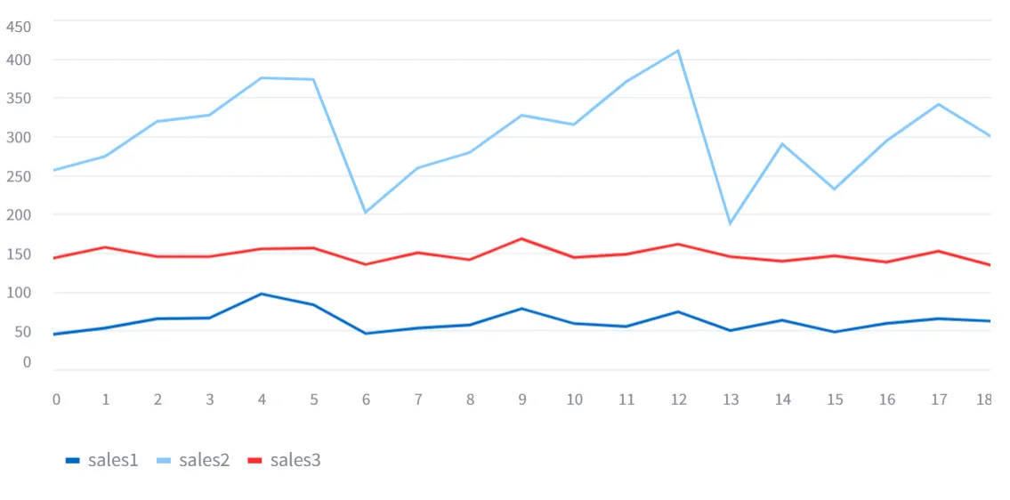
•
Simple Line Chart
# use_container_width=True 가로로 화면에 꽉 채워 줌
st.line_chart(chart_data, use_container_width=True)
Python
복사
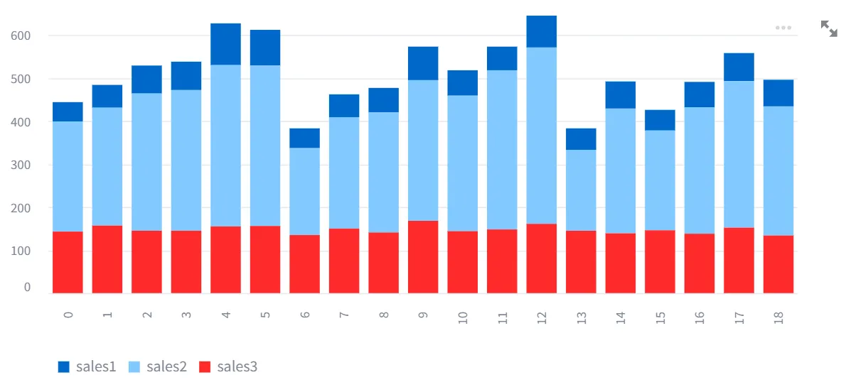
•
Simple Bar Chart
st.bar_chart(chart_data, use_container_width=True)
Python
복사
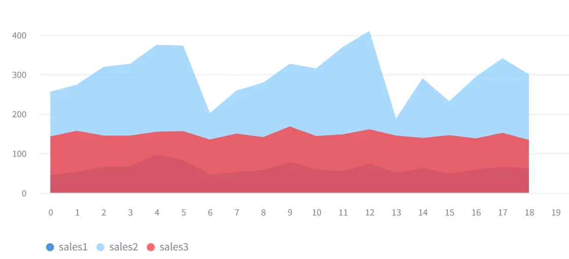
•
Simple Area Chart
st.area_chart(chart_data, use_container_width=True)
Python
복사
•
Altair Chart
◦
파이썬을 기반으로 돌아가는 인터렉티브 시각화 패키지
◦
선언형 방식 중 독특한 문법을 보여준다.
◦
필수 요소
▪
데이터, 마크, 인코딩, 인터렉티브(기본값 off)
데이터
마크
인코딩
인트렉티브
◦
추가요소(옵션)
▪
트랜스폼, 결합, 스케일과 가이드
▪
필터링, 결합, 디테일을 설정하기 위해서는 필요
▪
필터링을 위해서는 from altair import datum
트랜스폼
결합
스케일 & 가이드
데이터 컬럼과 x축, y축, 색상, 크기 등 encoding channel 간의 연결 정의
차트에 값 표시 가능, 데이터 설명 표시
grouping된 데이터가 아닌 unpivot(pd.melt)가 된 데이터를 활용해야 됨
import altair as alt
df = pd.read_csv('https://raw.githubusercontent.com/huhshin/streamlit/master/data_retail.csv')
# unpivot
df_melted = pd.melt(df, id_vars=['date'], var_name='teams', value_name='sales')
col1, col2 = st.columns(2)
with col1:
st.text('원본 데이터')
st.write(df)
with col2:
st.text('변경 데이터')
st.write(df_melted)
Python
복사
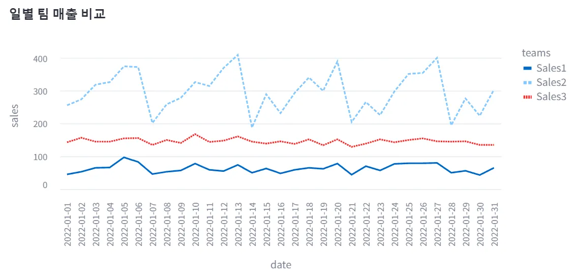
chart = alt.Chart(df_melted, title='일별 팀 매출 비교').mark_line().encode(
x='date', y='sales', color='teams', strokeDash='teams').
properties(width=650, height=350)
st.altair_chart(chart, use_container_width=True)
Python
복사
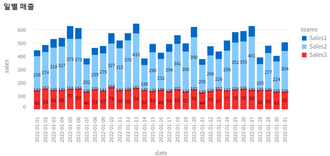
# Altair bar chart
chart = alt.Chart(df_melted, title='일별 매출').mark_bar().encode(
x='date', y='sales', color='teams')
text = alt.Chart(df_melted).mark_text(dx=0, dy=0, color='black').encode(
x='date',y='sales', text=alt.Text('sales:Q')) # detail 생략 가능
st.altair_chart(chart + text, use_container_width=True)
Python
복사
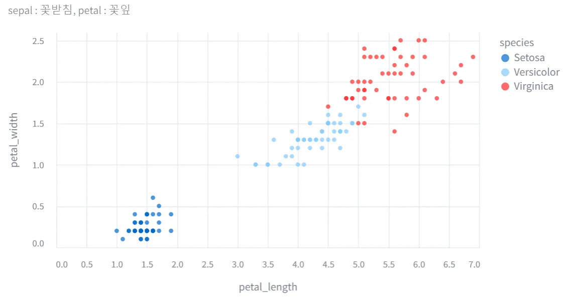
# Altair Scatter chart
iris = pd.read_csv('https://raw.githubusercontent.com/huhshin/streamlit/master/data_iris.csv')
st.write(iris)
# caption으로 'sepal:꽃받침, petal:꽃잎' 설명 출력하기
st.caption('sepal : 꽃받침, petal : 꽃잎')
# petal_length, petal_width로 Altair Circle chart 그리기
chart = alt.Chart(iris).mark_circle().encode(
x='petal_length', y='petal_width', color='species')
st.altair_chart(chart, use_container_width=True)
Python
복사
•
Plotly chart
반응형, 오픈소스 그리고 브라우저 기반 시각화 라이브러리
30개 종류의 차트를 가지고 있고, 3D 그래프도 지원
기존 matplotlib 함수랑 코드 유사
◦
plotly express
독립 실행형 라이브러리
< 기본 코드 >
import plotly.graph_objects as go
fig = go.Figure()
fig.add_trace(go.Scatter(y=[2,1,4,3]))
fig.add_trace(go.Bar(y=[1,4,3,2]))
Python
복사
import plotly.express as px
df = px.data.iris()
fig = px.scatter(df, x='sepal_width', y='sepal_length', color='species')
fig.show() # 바로 이미지 확인
# express 로 이미지 출력
fig.write_image()
Python
복사
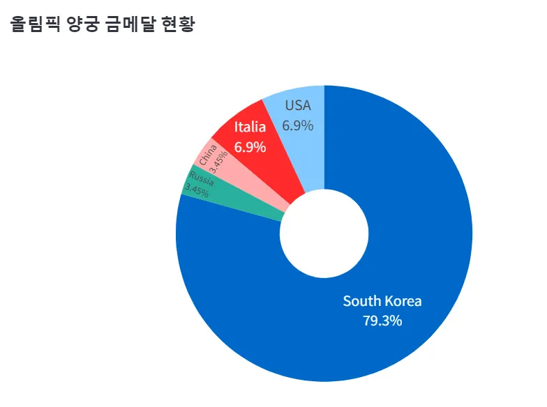
medal = pd.read_csv('https://raw.githubusercontent.com/huhshin/streamlit/master/data_medal.csv')
st.write(medal)
# plotly pie/donut chart
fig = px.pie(medal, names='nation', values='gold', title='올림픽 양궁 금메달 현황', hole=.3)
# 이미 생성된 그래프의 trace(데이터를 나타내는 개별 그래프 요소)를 업데이트하는 데 사용됨
# 특정 속성(색상, 라인 스타일, 마커 크기 등)을 수정할 수 있도록 해줌
# 차트 유형에 따라 옵션 값은 달라짐
fig.update_trace(textposition='inside', textinfo='percent+label')
# plotly에서 그래프의 레이아웃을 업데이트하는 메서드
# 전체적인 레이아웃 요소(축,제목,범례, 배경 색상, 폰트 등)를 조정할 수 있다.
fig.update_layout(font=dict(size=14))
# 범례 표시 제거
fig.update(layout_showlegend=False)
st.plotly_chart(fig)
Python
복사
Plotly Bar chart
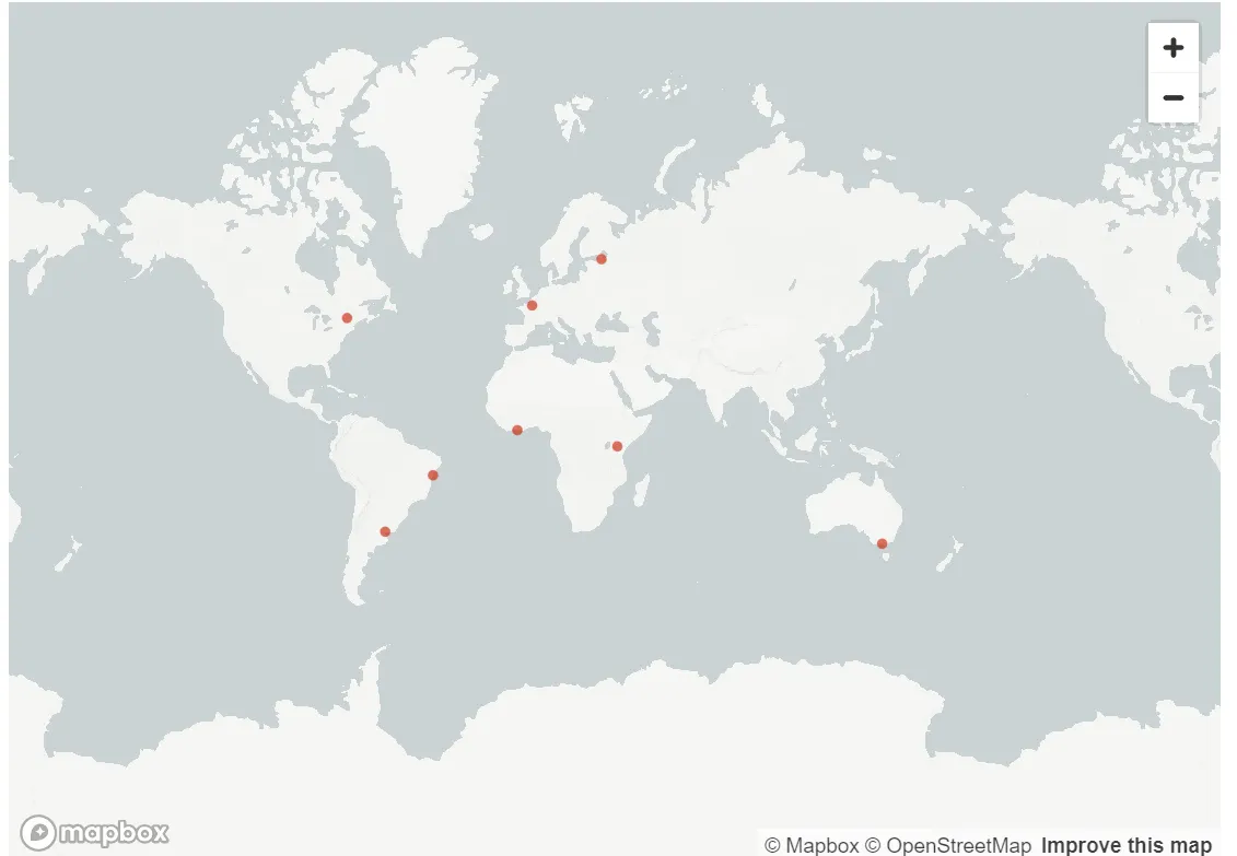
st. map
•
점으로 지도상에 위치를 표시한다
•
값을 보여주거나 원 크기 조절은 불가능하다
# 위도 : latitude 경도 : longitude
data = pd.DataFrame({
'lat' : [-34,49,-38,....],
'lon' : [-58,2,145,....]})
# 지도 그리기
st.map(data,
latitude='lat',
longitude='lon')
Python
복사
folium.map
•
Leaflet.js 를 기반으로 한 지도 시각화 라이브러리
•
파이썬 라이브러리인 Folium에서 제공하는 클래스
◦
지도 생성
◦
마커, 값 추가
◦
html 출력
◦
아나콘다에서 pip install folium
•
folium.Map() : Folium에서 지도 객체를 생성
•
location : 지도가 초기에 어떤 위치에서 시작할지를 정의
•
zoom_start : 지도의 초기 확대 수준(default =10, 숫자가 클수록 확대)
import folium
map_data = pd.DataFrame({
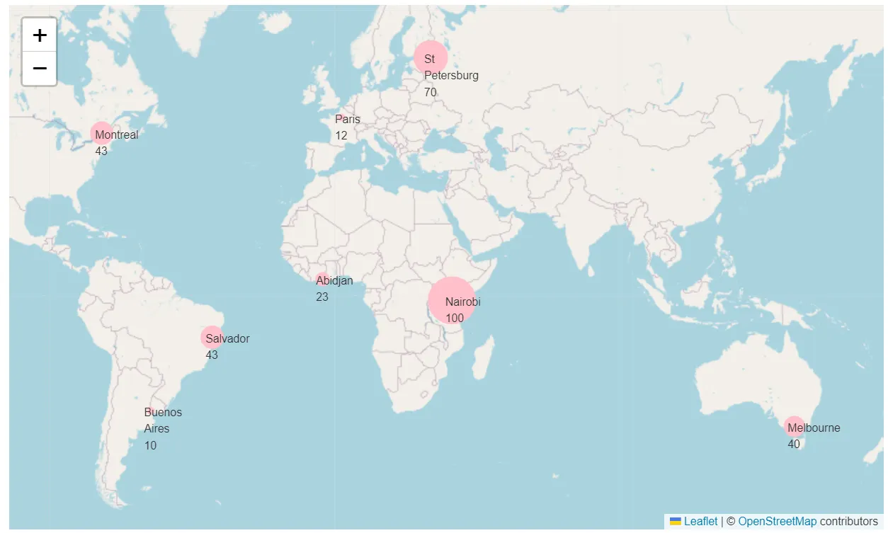
'lat': [-34, 49, -38, 59.93, 5.33, 45.52, -1.29, -12.97],
'lng': [-58, 2, 145, 30.32, -4.03, -73.57, 36.82, -38.5],
'name': ['Buenos Aires', 'Paris', 'Melbourne', 'St Petersburg', 'Abidjan', 'Montreal', 'Nairobi', 'Salvador'],
'value': [10, 12, 40, 70, 23, 43, 100, 43]
})
my_map = folium.Map(location=[map_data['lat'].mean(), map_data['lng'].mean()+30], zoom_start=2)
Python
복사
for index, row in map_data.iterrows():
folium.CircleMarker(
location=[row['lat'],row['lng']],
radius=row['value']/5,
color='pink',
fill=True,
fill_opacity=1.0
).add_to(my_map)
folium.Marker(
location=[row['lat'],row['lng']],
icon=folium.DivIcon(html=f"<div>{row['name']} {row['value']}</div>")
).add_to(my_map)
Python
복사
# 지도 그리기
# st.components.v1.html : Streamlit 라이브러리의 components 모듈에서 html 함수 사용
# .repr_html_() : 지도를 HTML 형식으로 표시
st.components.v1.html(my_map._repr_html_(), width=800, height=600)
Python
복사